Context
Ebis is an all-in-one business management platform, conceived as the definitive portal for a business’s entire ecosystem. It brings together information, tools, and the team in one place, covering areas like accounting, inventory, payroll, customers and leads, service orders, bookings and appointments, patient records, and manufacturing, among others. Its value proposition is to solve the fragmentation that many companies suffer from, automating and streamlining their processes and offering a holistic view of the whole operation.
The platform is made up of a backoffice where admins and managers handle all the unified information, and a mobile app that lets workers and managers capture data directly in the field. It’s a multilanguage, multicurrency solution built on a modern, stable, and secure infrastructure, where each company’s information is private and never shared with third parties.
This project was carried out as part of my practicum for a master’s degree in Usability and User Experience. The assignment focused on a specific business area, the use of Ebis on production lines, where the app was used kiosk-style. Workers operated tablets placed at different points along the production process, autonomously managing the line under their charge, while line supervisors tracked production progress and inventory movement. A representative case for this context was furniture factories, where chairs, tables, and other pieces are produced along a line.
The challenge
When I received the assignment, Ebis had an early prototype of this app built on an old version of Material Design, and it had noticeable usability problems. The platform needed to evolve, but under clear constraints. The product hadn’t launched to market yet, and the work was done remotely for a company based in the United States, which made it impossible to run usability tests with real users at this stage.
On top of that, there was an access constraint. I didn’t have direct access to the functional app, only to a development environment where I could view the system screen by screen, complemented by a video showcase of the process that I requested from the development team to understand the real flows.
On one hand, I had to rigorously identify the platform’s usability problems to communicate them to the development team. On the other, I had to propose an updated, scalable design direction that not only solved those specific problems, but also laid the visual and interaction foundations for the future of Ebis’s digital products, keeping in mind its vision of becoming a multi-device platform.
Role and responsibilities
As the Product designer in charge of this area, I was responsible for the entire diagnostic process, defining the solution, and building the design system. My key responsibilities were:
- Usability audit: I conducted a full heuristic analysis of the existing platform, evaluating each usability principle screen by screen to surface findings and improvement opportunities.
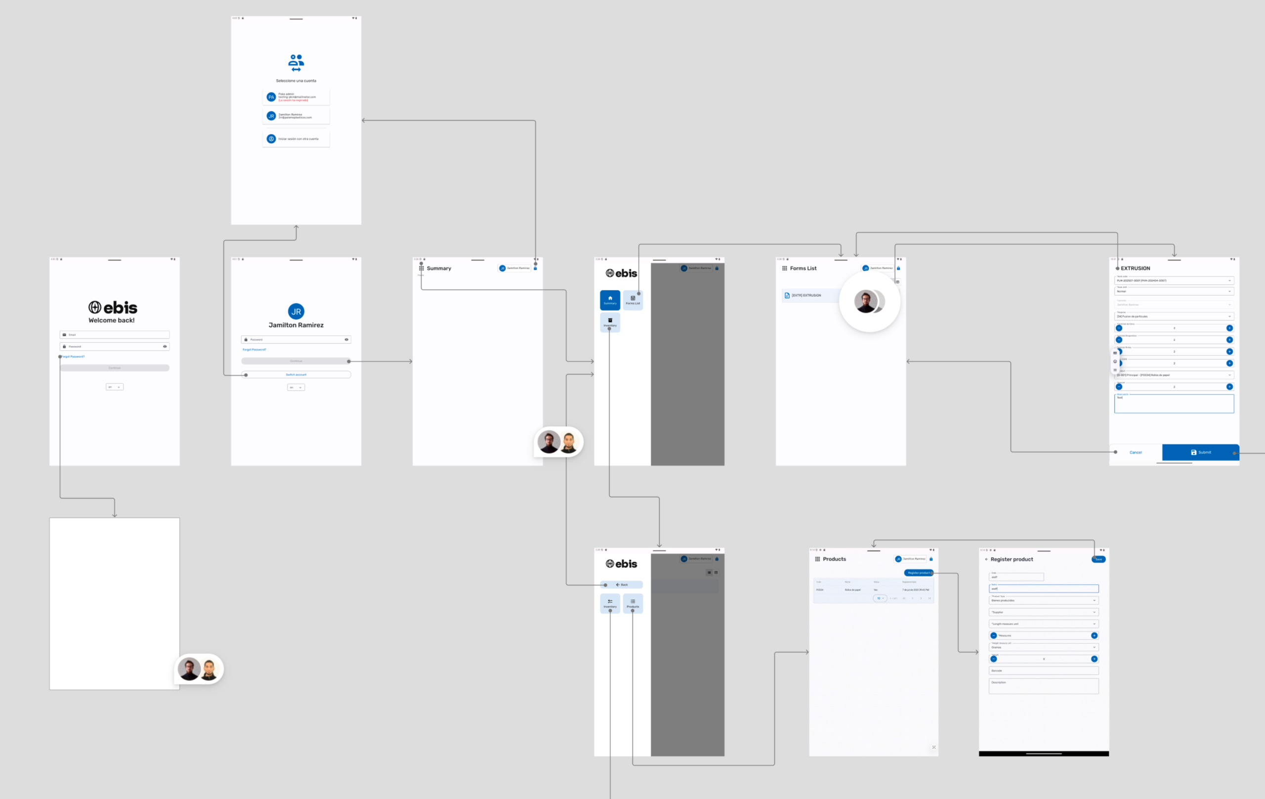
- Flow mapping: I reconstructed the app’s flows through a wireflow, connecting each screen to the next to understand the full process based on the development environment and the available support material.
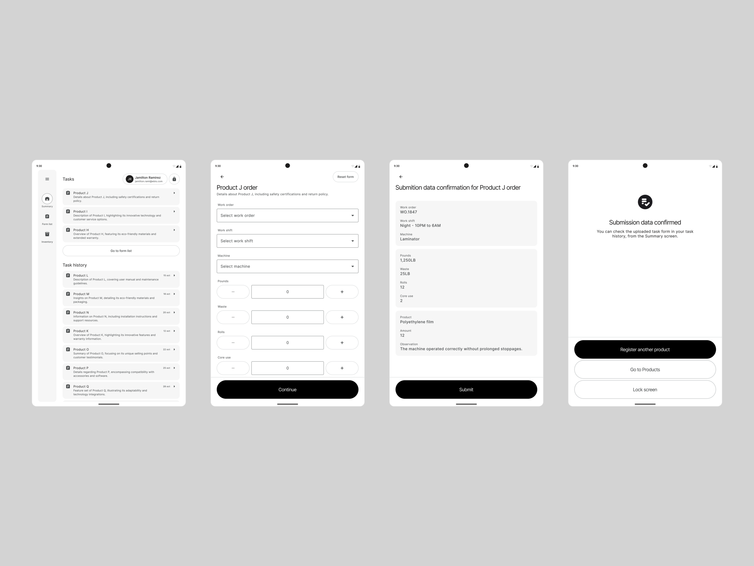
- Solution definition: I designed the new interaction patterns and wireframes that addressed the identified problems, optimizing the operation’s critical flows.
- Design system: I built a UI Kit from scratch based on Material Design 3, adapted to Ebis’s brand identity, designed to scale beyond this module.
- Prototyping and validation: I produced navigable prototypes in Figma for tablet and mobile, going through two rounds of iteration with direct validation from Ebis leadership and the development team.
The design process
My approach centered on diagnosing rigorously before proposing anything, and on building a reusable solution rather than isolated screens.
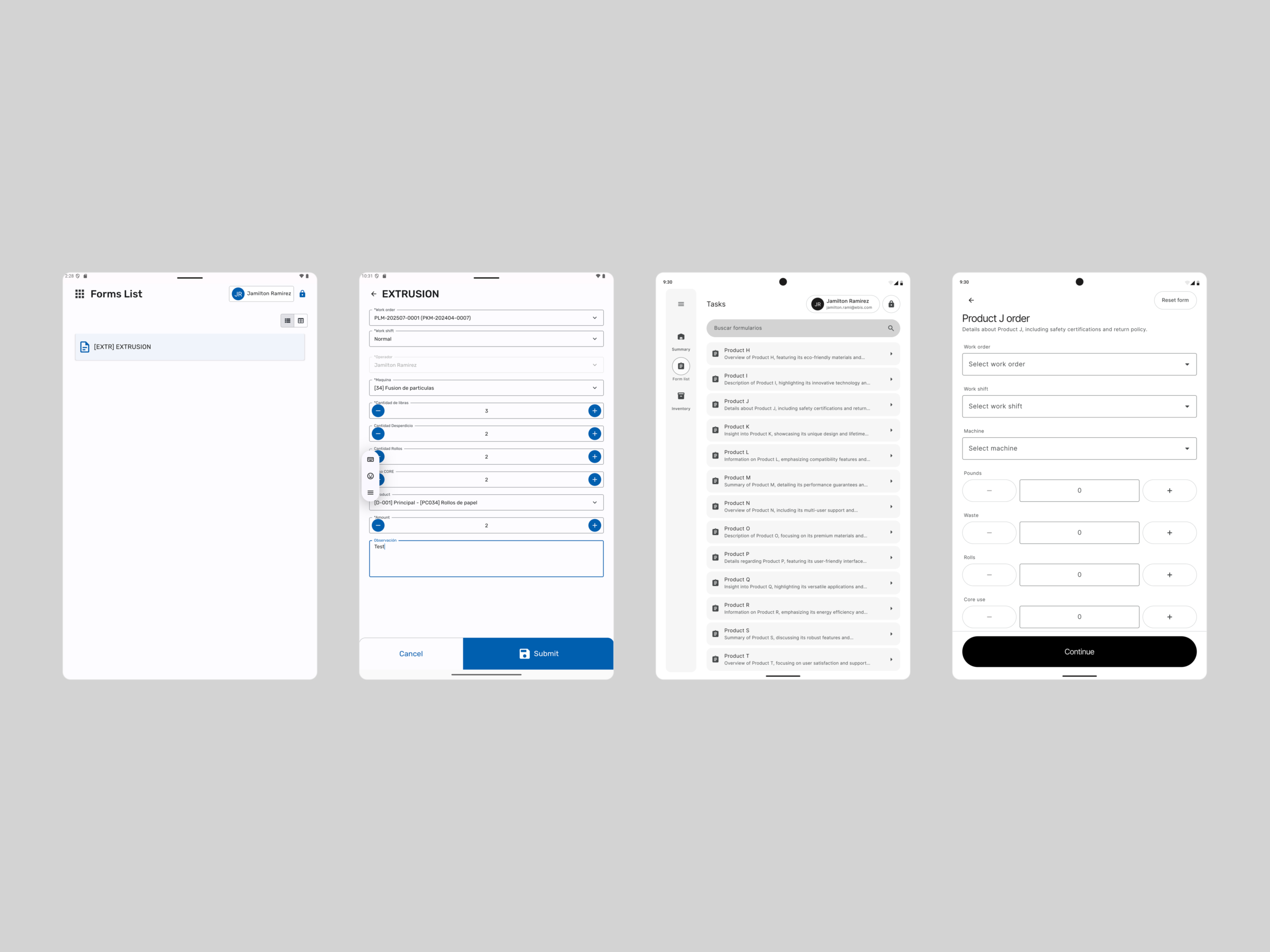
- Nielsen’s heuristic analysis: I went through the app screen by screen, from login and account selection to the forms list, the production form, and the inventory and product views, evaluating each one against Jakob Nielsen’s ten heuristics. Each heuristic produced concrete findings and actionable recommendations.
- Prioritized findings report: I consolidated the analysis into a document delivered to the company, where each finding came with its recommendation and was classified by impact level — high, medium, and low — so the team knew where to start. This report became the redesign’s roadmap.
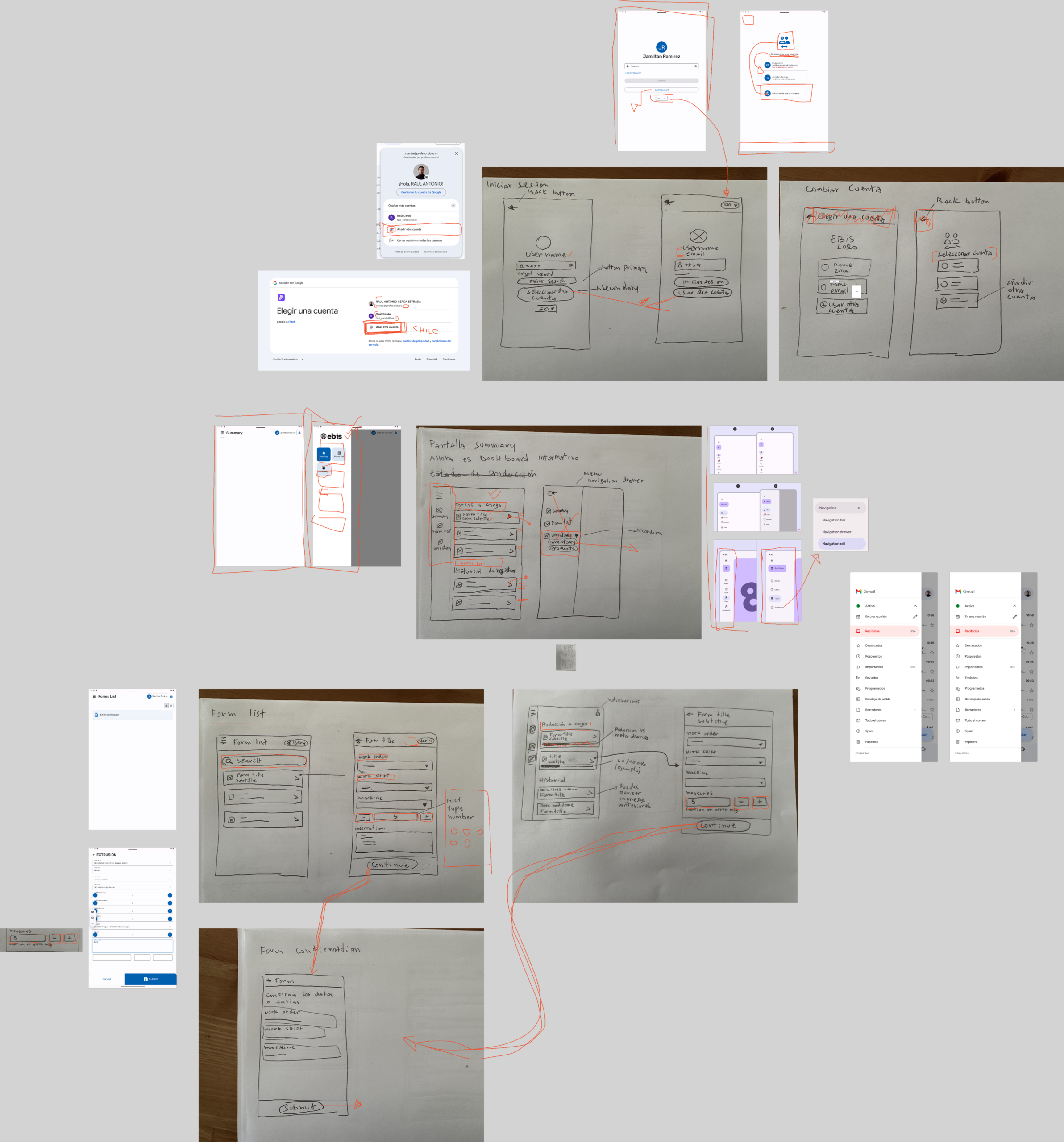
- Wireframes and design patterns: Since testing with users wasn’t possible, I grounded my decisions in UX and interface design best practices. I developed wireframes to show the development team the design patterns that solved each problem and let the platform scale over time.
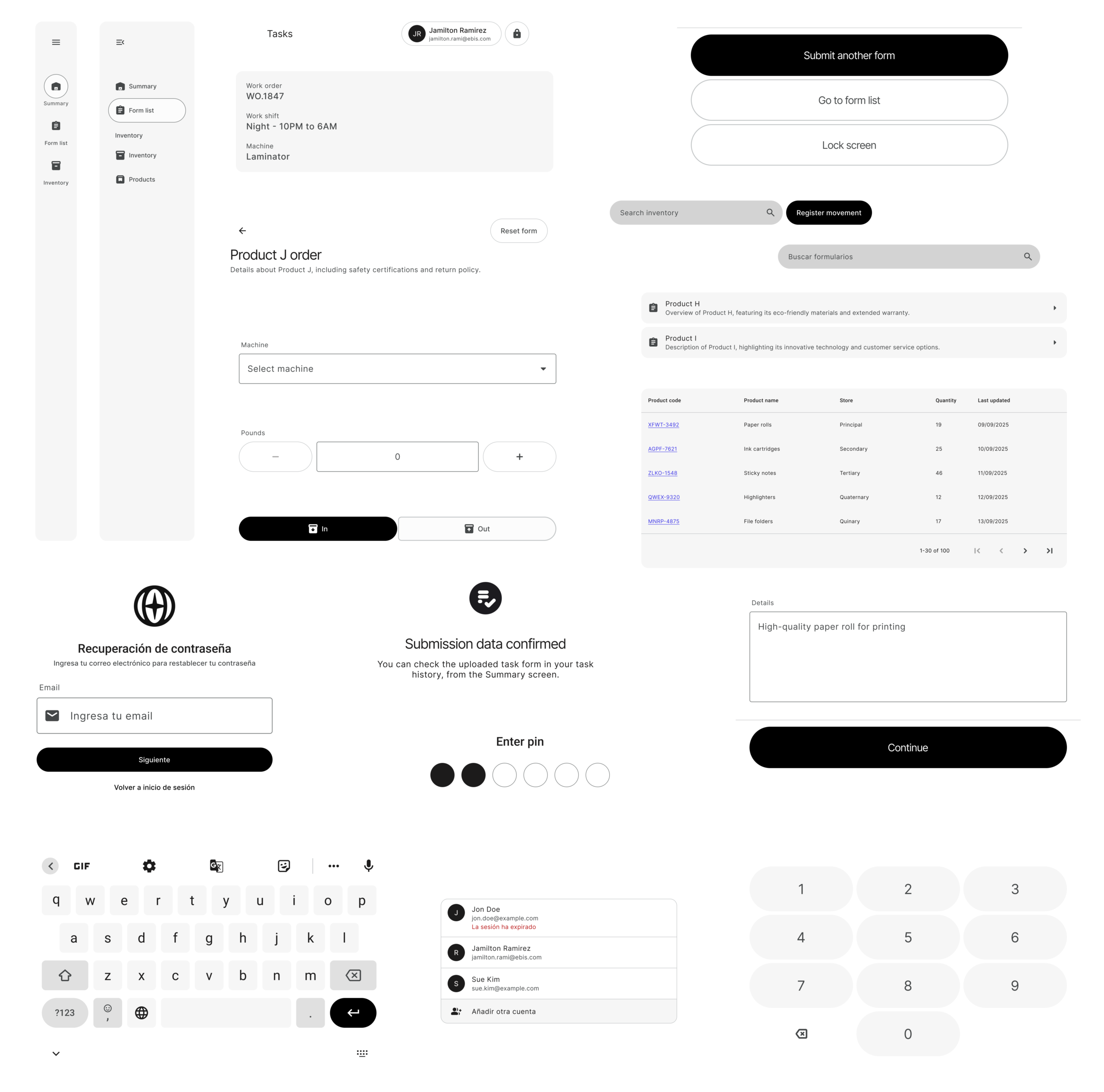
- UI Kit based on Material Design 3: I took the Material Design 3 UI Kit as a base and produced a styled version for Ebis, defining its primary, secondary, and tertiary palettes, plus every interface element needed: buttons, inputs, avatars, navigation bars, cards, carousels, tables, date pickers, menus, radio buttons, search bars, tabs, tooltips, iconography, brand typography, and much more.
- Multi-device prototyping: Given Ebis’s multi-device vision, I prototyped one version for tablet and another for mobile. The adaptable nature of Material Design’s components made this work easier, and I adapted content to each device’s paradigm based on the screen space available.
The analysis produced a map of prioritized findings that shaped the entire redesign. Among the highest-impact ones were the lack of feedback and system-status visibility, with no loading indicators at key moments and a home screen that was practically empty; low efficiency in the inventory and product tables, which had no search or filtering to handle large volumes of data; and insufficient error prevention in the production forms, with no real-time validation to catch incorrect entries. These three fronts defined the design work’s priorities.
About the solution
The redesign updated both the visual layer and the app’s critical flows, keeping the focus on a demanding work environment. Not every screen’s flow changed, but the whole platform adopted the new interface direction. The improvements centered on several key processes:
- Login and multi-user support: I designed an improved login that lets workers recover their password, something that wasn’t possible before. Since the same tablet or device is shared by several workers, we added PIN or password access, remembering accounts that already signed in on the device for faster access, and the ability to easily add accounts or sign out.
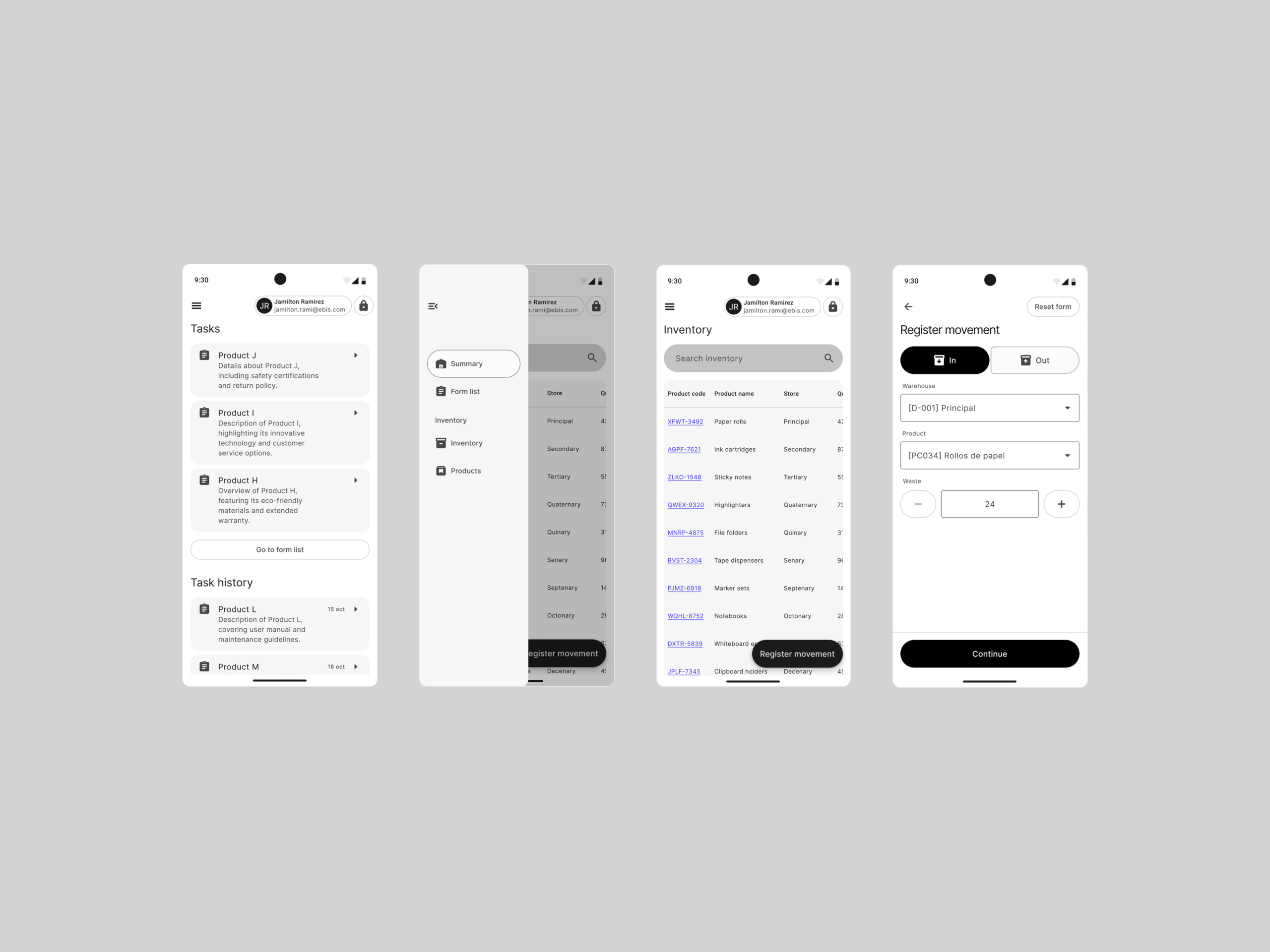
- Scalable navigation: I updated the navigation system to improve its scalability and give quick access to core work areas. Each worker’s main tasks became available without needing to open the menu.
- Home as an operational summary: The analysis had found that the home screen was practically empty and wasted. I redesigned it as a summary of the most important things the worker needs to do, with direct access to their tasks, turning it into a useful starting point instead of a content-free screen.
- Order management in a demanding environment: I designed the order-management components considering that tablets might be used with gloves on or in tough working conditions. Interface elements were sized for comfortable tapping, and we added the ability to quickly edit, validate information before sending it to management, and re-enter data smoothly, resolving significant friction from the previous version.
- Inventory visibility: We added processes the app didn’t have before, like access to inventory with dated data tables and visibility into internal inbound and outbound movements, improving traceability of the company’s processes.
Beyond this module, the UI Kit was conceived as a reusable foundation for future Ebis development, including its web area, so every new build starts from a coherent system that’s better aligned with the brand.
Results and impact
Given the nature of the assignment — focused on diagnosis, interface redesign, and building the design system’s foundations — it wasn’t possible to measure the final impact on Ebis’s end users, i.e. the workers and managers. I prefer to be transparent about this, since this was a design-foundation phase prior to launch and without access to real usage metrics.
Impact on the development team:
- The development team ended up with a complete component system for building new screens and flows. The process, in practice, became a matter of assembling reusable pieces instead of designing every element from scratch.
- The flows defined for this module became a reference for building future areas of the platform, giving consistency to its evolution.
Impact on the product:
- Ebis moved from an outdated design system to a modern visual foundation aligned with its brand, ready to scale to multiple devices and, eventually, to its web area.
- The heuristic report documented usability improvement opportunities, giving the company a clear roadmap to keep refining the experience going forward.
Reflections
This project taught me the value of diagnosing rigorously when you don’t have all the ideal conditions. Without direct access to the app and without the ability to test with users, heuristic analysis became a powerful tool for grounding design decisions objectively and communicating them convincingly to a technical team.
It also reaffirmed my conviction about the impact of building systems, not just screens. The greatest value I delivered wasn’t a set of finished interfaces, but a reusable foundation that changes how the team builds product. Getting those foundations right multiplies the design work’s value far beyond the specific project.